Perhaps no sport is more identified with its uniforms than baseball. The Yankees, Tigers and Dodgers uniforms are timeless classics. Mickey Mantle and Aaron Judge wore the same uniform. So did Hank Greenberg and Miguel Cabrera. Ditto with Sandy Koufax and Clayton Kershaw. The Red Sox and Cubs have played around with their road uniforms, but the home whites worn by Ted Williams and Ernie Banks are the same as the ones being worn by Mookie Betts and Kris Bryant today.
Then there are the teams that can't figure out what they want to do. Of the four 90s expansion teams, only the Rockies have maintained a consistent look. The other three have all gone through multiple logo/uniform redesigns...and these are three of the youngest teams in baseball! The Diamondbacks went from purple and green to red and black to...I don't know what to call that weird gray color and snakeskin jerseys. The Devil Rays turned into the Rays, going from a rainbow to dark green to navy in the process. The Marlins, meanwhile, can't go more than a few years without completely changing their identity. They wore teal, then they wore black, then they changed their name to "Miami." Now they've got black-on-black uniforms that are impossible to read!
Everyone else has changed up their uniforms and/or logos from time to time over the years. Sometimes a new owner wants a fresh start. Sometimes they moved into a new stadium (or city) and want new uniforms to go with it. Sometimes they're just looking for a change.
And sometimes a funny thing happens. A team can change its logo/uniforms and leave its fans missing the old one. A look that once seemed tacky and outdated is suddenly cool again. Which leads to old logos being revived (Orioles, White Sox) or updated (Blue Jays) or a combination of the two (Astros). Or, best of all, we get the throwback!
Whenever you see a throwback uniform on the field, it just makes you feel good. It definitely brings you back to another era. The Pirates' gold jerseys, black pants and pillbox hats bring me right back to Willie Stargell. Some are so wonderfully bad that it makes you wonder why the team ever wore them in the first place (Chris Sale was notoriously not a fan of the pullover throwback White Sox uniforms from the early 80s). Some are so good that they leave you scratching your head as to why the team would stop wearing them. And, fortunately, there are some looks (such as the Indians' all-red getup from the mid-70s) that have remained a part of history. At least so far.
Occasionally, we get treated to a "Turn Back the Clock Day" where both teams wear throwbacks. This can lead to amazing things like the Astros in the orange rainbow vs. the Mariners in their powder blue with their trident. Or, when we have the interleague World Series rematch from way back in the day, which gives us modern versions of uniforms from the early 1900s.
By my count, there are 11 Major League teams that have throwback uniforms. Five have the throwbacks as a part of their regular uniform rotation. Six others have a throwback that they wear from time to time. (Teams that wear throwbacks only for one-off special occasions aren't counted here.)
Of those six part-timers, three wear a modified throwback. The Mariners wear their current uniform design with their old blue-and-gold color scheme. The A's recently reintroduced a kelly green jersey reminiscent of the ones they wore to win three straight World Series in the 70s. Sadly, no gold version as of yet. And the Royals haven't gone full powder blue (which they totally should). They do have a powder blue alternate jersey, though.
The other part-timers are Tampa Bay, which occasionally wears the original Devil Rays home uniforms from their inaugural season; the White Sox, with those delightful early 80s monstrosities that Chris Sale loved so much; and the Twins, who have a throwback alternate home uniform from when they first moved to Minnesota in the 60s (which reminds me, can we, just once, get the Nationals in Expos jerseys, please?).
Which leaves us with five semi-regular throwbacks (again, Baltimore and Toronto don't count, since those are their regular uniforms): Milwaukee, Philadelphia, Pittsburgh, San Diego and St. Louis. All of which are so good and so popular that their worn multiple times per season. Some have even been designated as "Sunday" uniforms or "Friday night" uniforms.
Milwaukee: The Brewers' "ball-in-glove" logo is one of the best in the history of sports. (Although it completely boggles my mind how many people, players included, never realized that the pieces of the glove are an M and a B.) As this guy on Bleacher Report said, they really should just go back to these permanently.
Philadelphia: Bryce Harper's new team's current uniforms are actually sort-of throwbacks to the 50s and 60s. But they're bringing it back to the 80s with their incredible throwback alternates. Head-to-toe powder blue with that maroon P with the baseball in the middle (although the current version doesn't have the baseball). Beautiful on so many levels. So beautiful that you don't even mind the fact that they're wearing powder blue at home.
Pittsburgh: Another classic throwback to a bygone era. As I noted earlier, these uniforms just bring you back to a magical time with Willie Stargell and "We Are Fam-i-lee." There were actually nine different combinations with these uniforms. But the yellow top/black pants is the most classic of all those looks. The only thing missing is yellow batting helmets.
San Diego: Yellow and brown is a terrible combination. Except it worked for the San Diego Padres. The Padres have changed their logo and uniforms a lot over the years, but they still haven't gone back to the brown. Why not? It's yours! Own it! As for the throwbacks, these are more fauxbacks. The current wordmark and logo in brown and yellow. Not the Dave Winfield softball jerseys with the yellow sleeves, which would be so much better. At least they got the hats right, though.
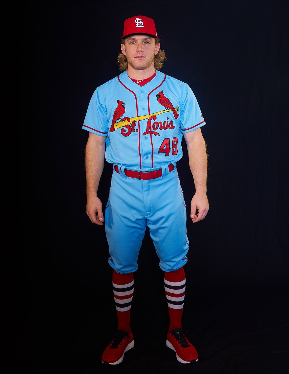
St. Louis: As classic as the Cardinals' regular uniforms are, they actually rock two throwbacks pretty well. They've got a cream-colored "St. Louis" that they wear for Sunday home games and a powder blue "St. Louis" that isn't exactly the look they wore in three World Series in the 80s. It's really just a powder blue version of the creams. Either way, it looks good.
Baseball isn't the only sport with throwback uniforms. But it's the sport where they work the best. And for all the throwback brilliance we've already seen, there's still so much more possible. Hank Aaron-Era blue and white Braves softball jerseys anyone?
/cdn.vox-cdn.com/uploads/chorus_image/image/3384783/50a62b4dc0382.preview-620.0.jpg)
No comments:
Post a Comment