I've always preferred their original set, which is why I'm so glad to see them back. In fact, I'd love to see them go back to the purple as their primary uniform. And they wouldn't be the first team to go back after a new look didn't quite go over the way it was intended. The Sabres, Islanders, Capitals and Penguins did just that in the NHL. So did both of New York's football teams. And the Chargers gave us an updated version of their beloved powder blues. We've seen plenty of other baseball teams turn a throwback into a revived primary look, too.
Then there's what the Blue Jays did. Toronto went through it's share of horrible uniform/logo decisions (anyone else remember the Black Jays?) before going back to a modernized version of their original logo. And their uniforms now rank among the best in the game. Same thing with the Orioles and their revived cartoon bird. Meanwhile, the Brewers have brought back their outstanding ball in glove logo, but haven't gone all the way by bringing their mid-80s uniforms back.
There are plenty of teams across the four major sports that would be served to go back to a retro logo/uniform set permanently, including the Diamondbacks.
Since I'm already on the topic, I'll stick with baseball. In fact, I'll stay in the NL West with the San Diego Padres. A lot of people would love to see them bring back the brown, which has always been kind of their trademark. The brown does live on as one of the Padres' throwbacks, but it's not the one I would restore. That would be the navy-and-orange look that they rocked when they won the pennant in 1998 (sadly, Greg Vaughn is the only person in this picture who's still alive).

While I'm on the subject, there's no more distinctive look for any baseball team than that of the Philadelphia Phillies in the 1980s. They wore them as a throwback for one game this season, but the maroon P with a baseball in the middle on a powder blue jersey is pure Phillies. It needs to come back today!

When they were founded, the Marlins were all in on the teal thing (it was the early 90s, after all). Eventually, they moved to black as their primary color and they actually looked pretty sharp. Then they changed their name from "Florida" to "Miami" and came up with like eight different combinations, none of which are better than their championship set from 2003, sported here by a rookie named Miguel Cabrera.

In the NFL, it's really only been in recent years where we've seen absolute uniform travesties. The Jaguars have liberated from those ridiculous two-toned helmets and gone back to a more sedated look. I'm not pushing for the revival of the NFL's two best-known throwback looks, either (that's, of course, Pat the Patriot and Buccaneer Bruce). I would like to see the Bucs' throw back a little, though. The logo on the helmets is way too big and what is that number font? Go back to what you wore when you won the Super Bowl 15 years ago.

And, this one seems highly unlikely, seeing as they've embraced their current look with their giant numbers, but I'd love to see the Bucs' 1976 expansion brothers, the Seahawks, go back to that monochrome blue look they rocked when they first switched from the AFC to the NFC.

If there's one team in the NFL that needs to ditch its current uniforms and revive a former look it's the Cleveland Browns. Maybe one of the reasons they're 1-31 over the past two seasons is because they look like a freakin' college team out there! Seriously, what's with the orange numbers on brown jerseys?! They've never had a logo, but they can at least bring the uniforms back to the classic look of their 1999 revival.

Plenty of NBA teams could use some help with their uniforms, too (actually, most NBA teams). None moreso than the Atlanta Hawks. They've gone through how many different uniform incarnations, each of which seems to be worse than the last? While it seemed somewhat garish at the time, their 1980s getup is probably the best, and it's also their classic look.

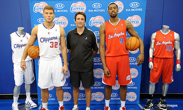
A lot of NBA teams have taken the same route as the Blue Jays and modernized a classic logo (the Warriors, the Pistons, the Jazz), so they're actually in pretty decent shape logo-wise. Although, that doesn't mean their aren't any other teams that could use a change. For example, I'd love to see the Nets drop their whole Brooklyn black thing. Nothing's worse than the Clippers, though. Were the uniforms they wore before their current ones really so bad?
Another team that owned purple at its inception was the Anaheim Mighty Ducks. Then they dropped the "Mighty," changed their colors to orange and black, and the logo went from the duck-shaped goalie mask to a duck's foot. Their current look isn't horrible. It's not as good as the original, though.

Finally, we've got the Winnipeg Jets. Much like the Hornets needed permission from the Pelicans to use the name and colors, but had to adopt a new logo, the deal between the Jets and Coyotes is probably similar. How great would it be if Winnipeg was allowed to wear one of those jerseys we saw in the stands during the first two games of the Western Conference Final all the time?

No comments:
Post a Comment