The only differences between the last four Super Bowl logos have been the number and the image of the stadium hosting the game in the background. And I bet you can guess what the Super Bowl XLIX logo looks like, too. Here's a great shot of the last four (since they began this standardized logo thing), along with a projection for next year's:
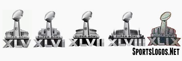
I must say, the NFL gets major points for creativity. (Hopefully we're done with this for the 50th Anniversary, which deserves a gold logo, especially with the game being played in San Francisco.)So why am I bringing this up now? Well, because that's an example of consistent branding that doesn't work. I can't think of a single person that likes having the same Super Bowl logo every year (and even fewer that think it's a good logo). I want to contrast that to an example of consistent branding that does work. Over the past few years, the NCAA has done a great job of rebranding the NCAA Tournament. Every floor used during the Tournament is the same, with the exception of the city and arena names along the baselines and the host team's logo in front of the benches.
But the best part is this. The NCAA has had the same logo template for the Final Four since 2007. Yet the Final Four logo in each of those years has been distinct.

It's a prime example of how you can have a consistent brand, but make the logo unique at the same time. The Final Four was in Detroit in 2009, so they incorporated a wheel and flames. In 2011, it was in Houston, so they made it look like the NASA patch. Since the Final Four was in Atlanta in 2013, they naturally had to include a peach. That spaceship that landed in Dallas (sorry, "North Texas") and Jerry Jones is so proud of is the star of this year's show. It makes sense that it's featured prominently in the Final Four logo.
The NCAA has even taken it a step further. The logo template used for the Men's Final Four is the same one they use for the Women's Final Four, as well as the Men's and Women's Frozen Fours.

That's the beauty of these logos, and where the NFL can learn from the NCAA. The brand message is consistent. You know it's an NCAA event. But they're also different enough to tell them apart. You're not going to confuse the 2011 Final Four logo with the 2014 Final Four logo. Even the colors are different. The same can't be said with the logos for Super Bowl XLV (Dallas) and Super Bowl XLVIII (New York). And that's the shame of it.
Hopefully the NFL eventually gets the hint and takes a page out of the NCAA's book. There's no problem with logos being similar or using the same template every year. There just needs to be some sort of variety to go with it. That's why the NCAA shines with the Final Four logo and the NFL fails with the Super Bowl logo.
No comments:
Post a Comment