Unlike the ridiculous MLB City Connect uniforms or whatever they're calling the latest new NBA uniform sets (which would be what? the fifth different option for each team?), I absolutely love the NHL's Reverse Retro jerseys. They've, of course, embraced this trend for a while now. Every Winter Classic features special uniforms for the game that, more often than not, are based on the participating teams' classic look. These jerseys, for the most part, are universally embraced, and how many teams have we seen revert back to an updated version of that look as their "new" logo shortly thereafter?
It's also given some teams the chance to honor their history, even if it isn't necessarily in the same city (or the same franchise). The Winnipeg Jets pay homage to the original Winnipeg Jets, even though that team is now the Arizona Coyotes. The Minnesota Wild's Reverse Retro is the logo of the Minnesota North Stars, who are currently the Dallas Stars. Likewise, the Hurricanes and Avalanche have outstanding Reverse Retro looks recognizing their past as the Hartford Whalers and Quebec Nordiques!
This season's set of Reverse Retro uniforms includes one for all 32 teams. Does it make sense for the Kraken or Golden Knights to have a Reverse Retro uniform? No! (Although, Seattle could go all the way back to the Seattle Metropolitans and do the S with "Seattle" inside it.) But I'm willing to overlook that little piece of historical inaccuracy, especially if the entire point was to give every team one.
Obviously some are better than others. The Red Wings and Blackhawks appear to have not put any effort at all into theirs. But others are spectacular. Lists like this are always purely subjective, but here are my 10 favorites...
10. Capitals: Yes, returning to the red, white and blue made complete sense for a team in the nation's capital (and literally named after the nation's capital!). But there was that era in the late 90s when they strayed and had that blue and black color scheme with the logo they called the "screaming eagle." Last year's Reverse Retro was the "screaming eagle" in their current color scheme. This year, he's back with his original colors (although, I think they wore a blue jersey with black trim when this was their regular uniform)!

9. Bruins: Remember when the Bruins had a mustard-colored third jersey with a bear's head on it? They've had different variations of their stoked B for so long, that it always catches your eye when they do something else. Is this jersey/logo particularly memorable? No. But I do like it, if only because it's nice to see the Bruins do something different.
8. Avalanche: Last year, they hit a home run with their homage to the Nordiques. This season, it's a sort-of throwback to the Colorado Rockies (the ones who became the Devils, not the baseball team). The C is also the Colorado state flag. While not nearly as good as last year's, it's still a solid follow-up.
7. Ducks: If there's any team that should go back to its original logo and color scheme, it's the Ducks. I get why they changed it. Disney sold the team, dropped the "Mighty", and changed the colors and logo. But the angry, duck-billed goalie mask is still one of the great logos in NHL history! They lose points here because it's in the current colors instead of the original purple and teal.
6. Rangers: The Rangers' original Lady Liberty is one of the great alternate jerseys in NHL history! It was very sad when they took it out of circulation. So it makes me very happy to see that it's back! There are slight variations from the original, but they're so negligible that they've pretty much brought it back exactly the same.
5. Sharks: What I absolutely love about this jersey is how the Sharks' Reverse Retro is a callback to the dearly departed California Golden Seals, the original Bay Area NHL team. It's almost an exact replica of the
Golden Seals' jersey, which is on display at the Hall of Fame. The Golden Seals were the last team in the four major leagues to fold, but it's nice to see them live on through the Bay Area's current franchise.
4. Penguins: USA Today liked this one the best, and it's definitely up there. The Penguins switched back to their original logo at the start of the Crosby/Malkin Era, but this one will always make me think of an in-his-prime Jaromir Jagr skating circles around everyone else. Plus, the robo-penguin is a pretty solid logo in its own right!
3. Islanders: When the fisherman first arrived in the mid-90s, he was so universally derided that he only lasted one season. But you missed him, didn't you? It's OK, you can admit it! What makes this version of the jersey so much better than the original is that they didn't go nuts with the wavy lines in multiple colors this time. This one actually looks pretty sharp.
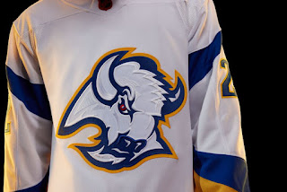
2. Sabres: I'll be honest. I may be a little biased on this one. I'll always have an affinity for the Sabres' buffalo head logo. When I was going to college in Buffalo, it was the Sabres that were good and the Bills who sucked, and I went to many a game wearing my black, red and silver Sabres jersey. So, it made me sad when they changed to that ridiculous "buffaslug." And, because of how much it means to me and the memories from that formative time in my life, I'll always prefer the buffalo head to any other Sabres logo, past or present.
1. Kings: They've been so associated with black and silver for so long that so many people don't even know the Kings' original color scheme was purple and gold to match the Lakers. If you think about it, it actually works, too, since purple is considered a very regal color. Their Reverse Retro is a modern take on their original uniform from their expansion season. And it's absolutely superb! I love the simplicity of it. It's just a crown, but an incredibly detailed crown. Simply beautiful.


No comments:
Post a Comment